Explore Our

Brand Guidelines

Brand Guidelines

Overview

It all starts here.

Take a look and get to know our new brand territory. SGH is a storied firm with a limitless future. Our brand identity reflects our depth of expertise and our commitment to clients and the industry at large. We are all ambassadors of our brand, and share the goal of delivering a consistent image in all interactions with our clients, colleagues, competitors, potential employees, and throughout our profession. Today, with more than 750 employees in office locations throughout the United States, we remain committed to our founding values, striving to be outstanding in everything we do. Our brand reflects this and sets the foundation for our future.

WE ARE SGH.


Play Video

Performance beyond expectation.

See our new brand revealed in this short video.

See our new brand revealed in this short video.

Brand messaging.

SWIPE LEFT

Performance beyond expectation.

Envision a world resilient to all forces. We engineer the important and treasured structures of a community for today’s needs and future realities. Because bold visions require bold thinking.

Solving complexity is our standard.

Whether making a seemingly impossible design a reality or solving a performance problem that has proven elusive, SGH brings clarity to complexity. Our teams deliver customized and reliable solutions for our client partners — advancing the meaning of what’s possible.

Guiding superior performance through unparalleled experience.

You have to test the limits to know the limits. We constantly question the “why” to better understand how structures and materials behave. Our collective knowledge provides us with a unique lens to investigate and explain failures, help codify standards today, and innovate the future.

Helping engineer what's next.

The only way to advance is to question and explore. Every member of the SGH team is both a learner and an educator, committed to advancing our industry. Together we are creating a community that never settles for what is, but always seeks what could be.

Boilerplate language.

Simpson Gumpertz & Heger (SGH) is a national engineering firm committed to delivering holistic advice for our clients’ most complex challenges. We leverage our collective and diverse experience, technical expertise, and industry knowledge of structures and building enclosures, advanced analysis, performance & code consulting, and applied science & research to deliver unrivaled, comprehensive solutions that drive superior performance. With 750 employees in nine office locations throughout the United States, SGH’s industry-leading teams constantly seek to advance the meaning of what’s possible.

Visual Elements

Our logo.

Our logo.

A force for the future.

Research revealed that our clients and the industry know us by “SGH,” so we created a logo to emphasize that. While Simpson Gumpertz & Heger is still the name of our company, it is no longer required as part of our logo. Use the full name typographically once in a communication, otherwise feel free to use the shortened version of “SGH.”

Our logo uses bold type to signify SGH’s bold thinking. The curved openings in the letters reference a force, moving through the solid, resilient structure of the letters. The connection of the letters to each other indicates unity, and bringing together multiple disciplines to create solutions. The strong cross bar in the H speaks to continually raising the bar for building performance and the industry, while the upward tilt of the notch creates forward movement with an eye toward the future. The gold diamond represents our gold standard–going above and beyond the bar we set.

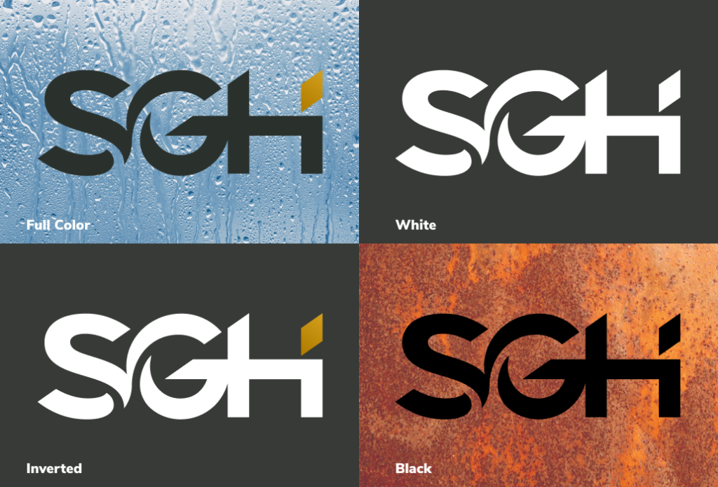
The logo has one form, with different color versions that can be used on either light or dark backgrounds, plus one-color versions when the production method is more limited. The full color version is the preferred mark.

Logo guidelines

Clearspace & Minimum size


Clearspace
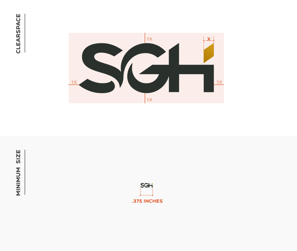
To preserve the integrity of the logo, a strict perimeter, free of type and graphic elements, must be maintained. The safe area of the SGH logo is based off the dimensions of the diamond. Orange indicates clear space. The minimum required clear space is defined by the measurement ‘X’.

Minimum Size
A minimum size has been developed to ensure that the logo is clearly legible. The SGH logo should never appear at a size smaller than 0.375 inches wide.


Clearspace & Minimum size

Logo Misuse

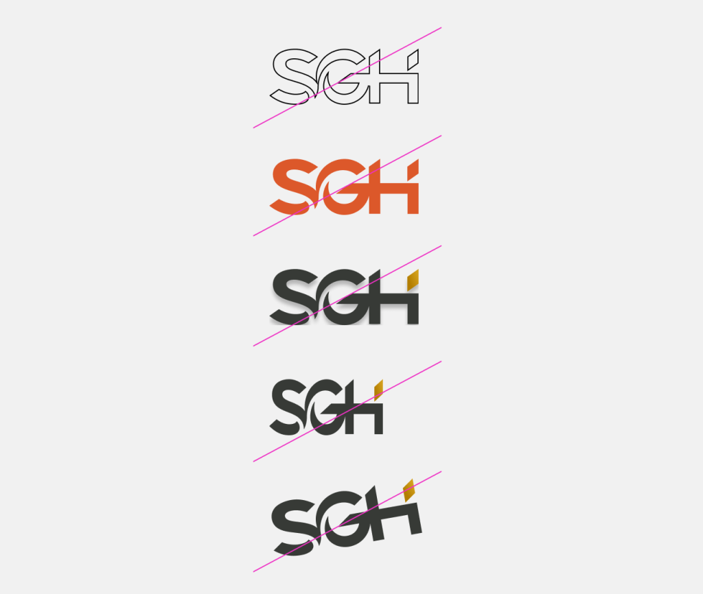
Every element of the logo’s design is intentional. Do not change its proportions, styling, spacing, or color in any way.

Do not

  • Outline
  • Alter colors
  • Add any graphic elements
  • Skew or stretch
  • Rotate
Logo Misuse

Brand Colors.

Primary

Charcoal

PMS 447 C
CMYK 70 57 63 65
RGB 55 58 54
Hex 373A36

Gold

PMS 7555 C
CMYK 2 28 97 12
RGB 210 159 28
Hex d29f1c

Gold Gradient

PMS 7551 C   |   7555 C
CMYK 0 36 100 26   |   2 28 97 12
RGB 179 126 0   |   210 159 28
Hex B37e00   |   d29f1c
Secondary

Blue

PMS 4160 C
CMYK 97 31 11 59
RGB 0 72 96
Hex 004860

Light Blue

PMS 2170 C
CMYK 62 22 1 1
RGB 95 155 198
Hex 5F9BC6

Green

PMS 3298 C
CMYK 100 0 67 40
RGB 0 106 82
Hex 006A52

Light Green

PMS 7464 C
CMYK 36 0 15 0
RGB 160 209 202
Hex A0D1CA

Tan

PMS 7527 C
CMYK 12 10 14 0
RGB 214 210 196
Hex D6D2C4

Orange

PMS 7579 C
CMYK 0 75 93 0
RGB 220 88 42
Hex DC582A

ADA Orange

Hex C54C20

Typography.

Typefaces

As brand ambassadors, use consistent typefaces for any materials sent out on behalf of SGH. Specific fonts create a distinctive appearance across all mediums, allowing for messaging hierarchy, and enhancing brand recognition.

Standard SGH Word templates are available, already embedded with brand-compliant fonts. Follow these guidelines for new and custom documents.

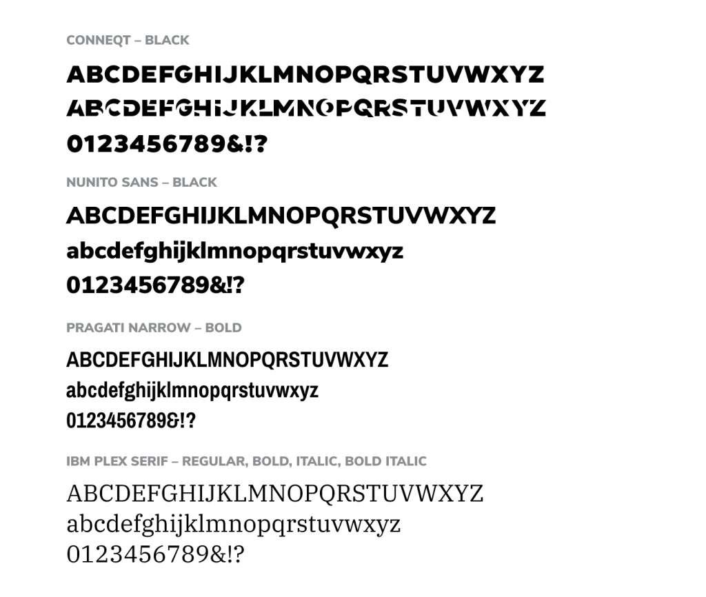
Typefaces

Fonts

Conneqt
Sans serif font used for headlines or statements of emphasis. The characters shown on the right are approved variations accessible in software programs under the menu item Glyphs or Alternates. Use glyphs sparingly, as the first character in a headline or first letter of a key word.

Nunito Sans
Sans serif font used for larger introductory text and subheads.

Pragati Narrow 
Sans serif condensed font used for headlines and sidebar subheads.

IBM Plex Serif
Serif font used for body copy.

Fonts

Photography.

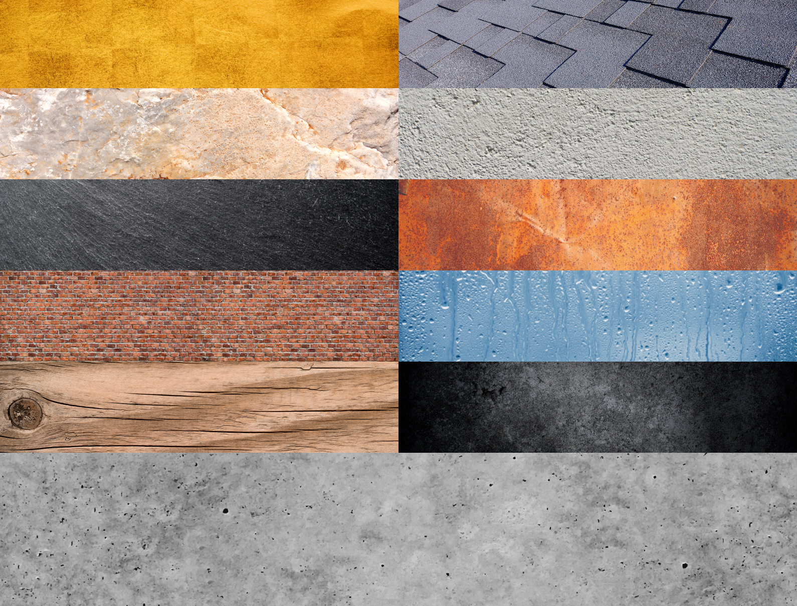
Photography provides the opportunity to highlight the culture at SGH—our people, the work we do, and the materials that we investigate. As we continue to build our inventory of images, please consider these guidelines. Our photography is categorized by people, projects, hero images, and materials. A library of our photography is located within OpenAsset. Please contact marketing if you need access.

Open Asset Photo Library
Iconography.

Iconography.

SGH’s unique icon set provides symbolism, and can be built upon to visually represent concepts or topics. There is an intentional openness in the stroke line in the icons that reflects the openness of the logo. The use of brand colors as a highlight provides visual interest. Where opportunities exist, we have chosen to incorporate the curved arc element of the logo into the colored accent.

Patterns.

A unique set of patterns enhances the visual identity of the brand. The patterns are inspired by the diamond element in the logo, and are offered in a variety of brand colors. Use them as backgrounds or in sidebars sparingly.

Patterns.

Brand usage

Brand usage examples.

Stationery

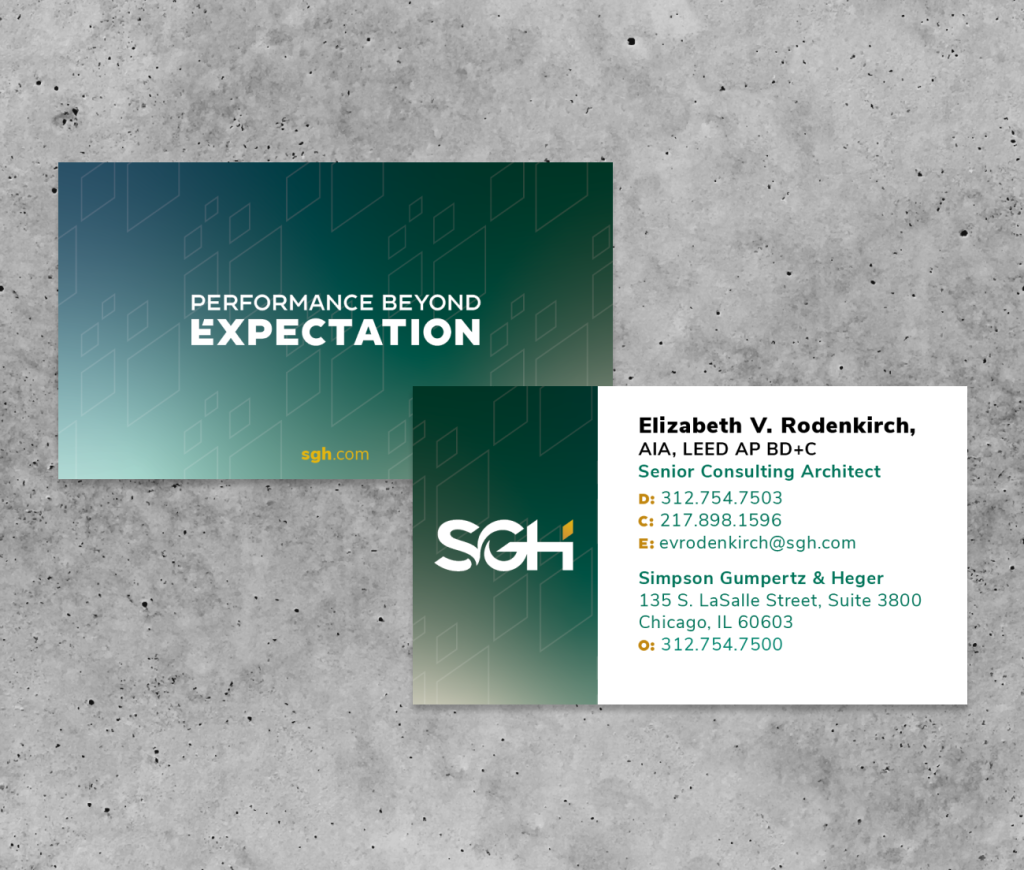
Business Card
The SGH business card is a physical representation of our brand and a tangible way to connect with people. From the soft touch finish to the spot gloss varnish, these are a physical manifestation of our attention to detail and intentionality with material selection.

Letterhead, Envelope & Mailing Label
While we continually move toward a more digital world, we recognize that printed material continues to be necessary. The SGH letterhead, envelope, and mailing label reflect our brand and the quality we stand for. Each office location will have its own materials.

To place an order, please contact your administrative assistant.

Stationery

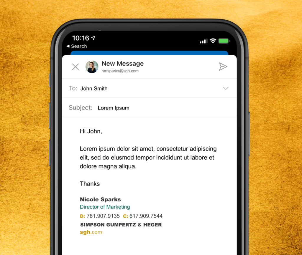
Email Signature

The SGH brand has a unique signature for any email correspondence. Please do not add to, edit, or modify this signature. Please note this is the only place where Arial, a basic web-safe font is used. A web-safe font is one that is installed on almost every Windows and Mac device by default, which means it will look seamless on the recipient’s end regardless of device types and/or email platforms.

IT will deploy this in your email application.

Email Signature

Cut Sheet & Proposal

Cut Sheet
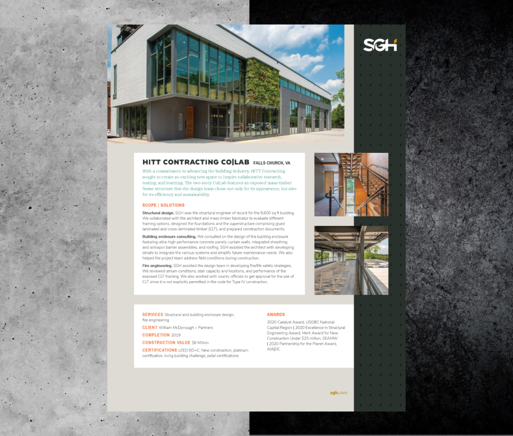
The cut sheets use compelling images, concise language, and a clear hierarchy to emphasize the value that we bring to a project.

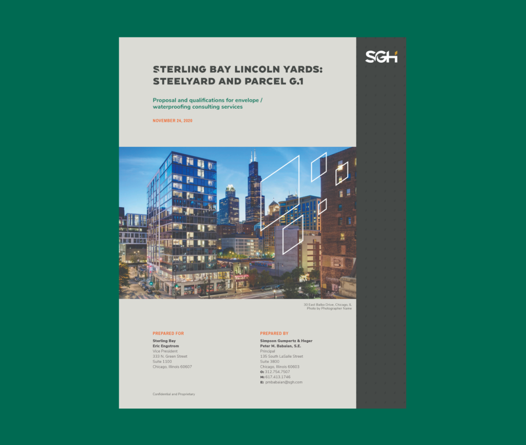
Proposal
The proposal system is designed with flexibility to accommodate varied types of tailored content while creating a clear hierarchy of information and brand consistency.

Please contact marketing to create a cut sheet or proposal for one of your projects.

Cut Sheet & Proposal

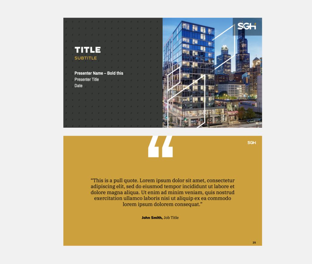
Powerpoint

The SGH PowerPoint template allows for flexibility of content while maintaining brand standards. The brand typefaces are embedded into the template.

Please use this image as a visual reference to be sure fonts are rendering properly.

Powerpoint

FAQs

Have questions?

We have answers

Why did we refresh our brand?

Branding is much more than a name and symbol. It’s the sum total of all the experiences our clients, prospects and associates have with our company. Our brand should reflect the essence of who we are, how we are perceived and ultimately create an emotional reaction. With this brand refresh, we recognized the opportunity of aligning both our verbal and visual brand to the SGH of today and who we aspire to be in the future. During this process we engaged internal and external audiences. 426 associates nationwide participated in a survey or townhall and 257 clients from around the globe were interviewed or surveyed. The exciting part is that we consistently heard the same thing and from this information the refreshed SGH brand was created. Bold, modern, approachable, and distinctive, we now have the messaging and visual elements to authentically represent who we are.

Why did we take the full company name out of the logo?

While our name is still Simpson Gumpertz & Heger, research showed that our clients and industry know us by SGH. Our new logo and primarily how we identify ourselves now reflects that.

Where can I find our new logos and fonts?

Logos and fonts are available in the downloadable resources section below. For questions on usage, please contact marketing.

How do I know which logo variation to use?

The full color version of the SGH logo with the gold diamond is the preferred option for general use. In the event that production methods are limited, one-color versions are available.

Having trouble deciding which file format is most appropriate? Contact the Marketing team and we can help guide you.

Are there any special formatting guidelines I should consider when using our new logo?

Our logo file incorporates a proper amount of clearspace around the image area to avoid a cluttered layout. The logo should never be sized smaller than 0.375”.

Need advice on placing a logo? Refer to pages 12-15 of the Brand Guidelines or reach out to anyone on the Marketing team.

How can I incorporate the new color palette, iconography, and patterns?

Our Brand Guidelines, which you received in print as part of the brand launch, and are also available digitally, provide details on using all elements of the new brand.

Will Word documents use a style gallery similar to our old Word templates?

Our goal is to update all SGH materials to the new brand for a modern and consistent look and feel, while keeping them easy to use. The Marketing and Administrative teams are working together to implement the best approach for each of the different templates.


How can I update a document that was created in the former brand with the new branding?

Our new brand identity provides a full suite of templates and stationery to meet your external communication needs. These documents include:

  • Letterhead for correspondences and letter proposals.
  • PowerPoint template for client presentations, shortlist interviews, webinars, and lunch talks.
  • Marketing proposal document for tailored and custom RFP responses.You should create all internal and external communication using the new brand identity. Need help working with our new templates? Please contact your Administrative Assistant with Word template questions. Marketing staff can assist with client presentations and custom proposal documents.

A client has asked me to make an update to a previously submitted document. Can I still use the old template?

It’s unnecessary to redesign former documents in the new templates, but you should consider it when updating longstanding and important materials. All newly created documents should reflect the new brand.

How do I update my resume?

All resumes will be converted to our new template. Please do not use resumes formatted using our former template. All staff resumes can be accessed in your office’s admin folder.

If you need to update your resume with current registrations and project information, please contact your Administrative Assistant.

I like to share project information and materials with my clients. Will our marketing collateral be updated to reflect our new brand?

All marketing collateral that is available for general use will be updated to reflect our new brand identity. You can access these documents in the Marketing folder on the I:drive. 

Where do I find my office’s letterhead?

Updated digital letterhead will be available in Word’s shared templates, as it is now. You may also find it in the Corporate Operations/Marketing folder on the I:drive.

Where can I find photos?

Project and team photography is a strong visual element and an effective tool for presentations, marketing collateral, and proposals. A photo library of our project experience and people at work can be found in OpenAsset. Contact anyone in Marketing for access to OpenAsset or more information on how to use it.

Got a great photo of your project or project team onsite or collaborating in the office? Please pass it along to the Marketing team – we are always looking for images that reflect SGH work and culture. Note: be sure to consider any client and/or project confidentiality restrictions before taking and sharing photos.

Downloads.

Hover to learn more

Tap to learn more

Downloadable Resources

Brand Guidelines

Brand Guidelines

Brand Guidelines

Download

Logos

Logos

Logos

Download

Fonts

Fonts

Fonts

Download

Icons

Icons

Icons

Download

Patterns and Diamonds

Patterns and Diamonds

Patterns and Diamonds

Download

Green Gradient

Green Gradient

Green Gradient

Download

Powerpoint

Powerpoint

Powerpoint

Download

Explore our new website.

As part of our new brand, we have launched a new website experience to support our goal of delivering a consistent image in all interactions with our clients, colleagues, competitors, potential employees, and throughout our profession.

Let’s go
Explore our new website.